Keyless Entry
With the expansion of Mobile Key across Marriott properties, enhancing the digital entry experience enables our busiest travelers to redefine their arrival experience.


Expediting the check-in experience
Through the mobile app, guests can not only use their phone as their key but also bypass the front desk for check in. Eliminating these core transactions, where a guest might engage with an associate, increases our responsibility to ensure the guest can get to their room independently with the support of the app. As design lead, it's my responsibility to work closely with internal stakeholders to continually advocate for an optimal guest experience.

Capturing edge cases in the design
This user flow illustrates the complexity of Mobile Key. In its design, I have accounted for each scenario where a guest may encounter an error, need access to a tutorial or even opt to speak to a member of the staff for support.

Mapping the journey to understand the user
Working side by side with the my team's user researcher, we mapped the guest journey of Mobile Key. This journey served as a reference point throughout the project lifecycle, and along with data metrics, continues to guide the focus of user interviews, observations and usability research.

Data to better inform design
As refinement of the Mobile Key experience became paramount, internal stakeholders requested that we take a closer look at areas where guest engagement drops off. I worked with a teammate to create this sketch that identifies key areas where an in-app survey would be useful to gain deeper insight into guest behavior.

Taking a wholistic view
In order to better frame the existing guest experience, creating a high fidelity flow aids internal stakeholders in having a more fluid conversation about gaps in the experience. I created this visual flow to illustrate the current guest experience. Eliminating unnecessary steps and simplifying the visual design were a few of the recommendations we collaboratively generated.


Improving the design to educate the user
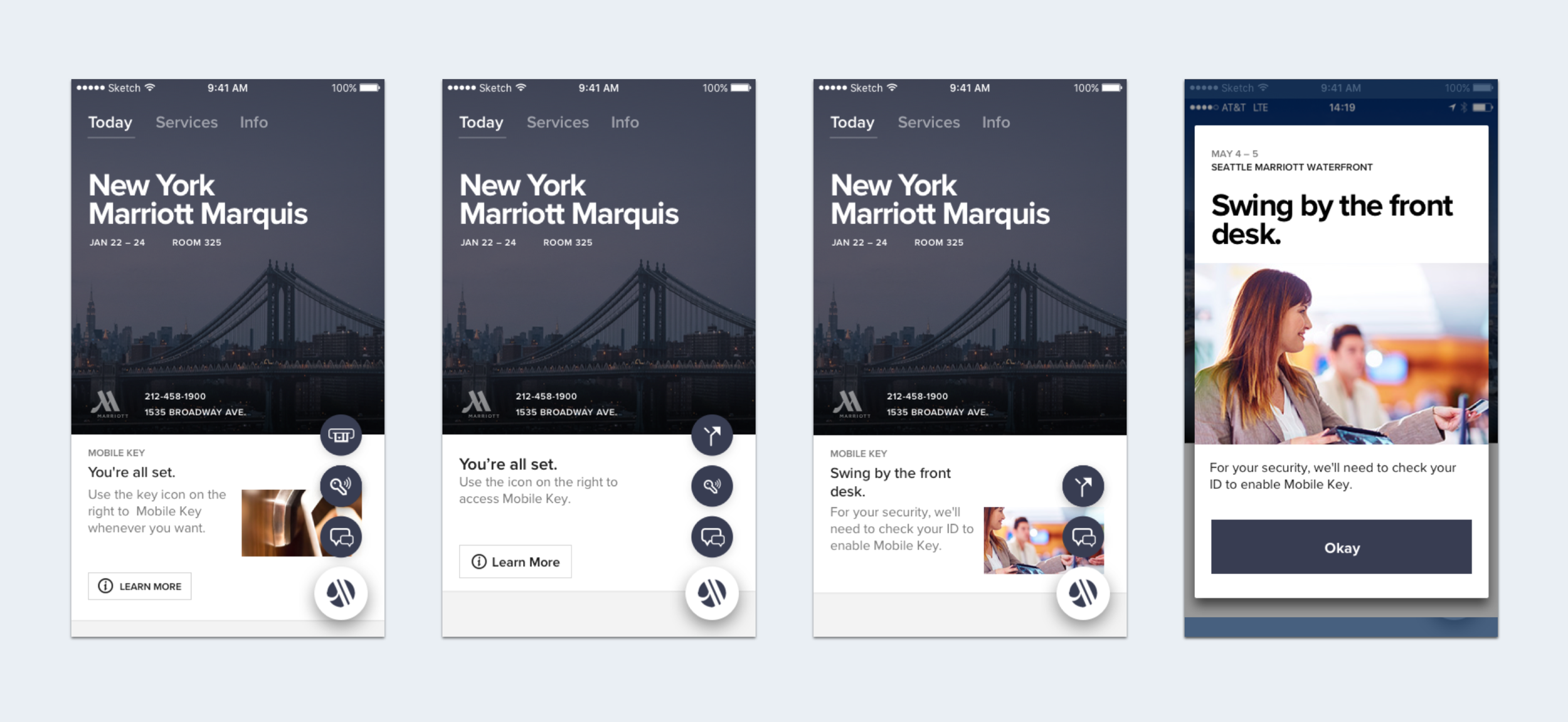
Simplifying the flow, updating design elements and providing more concise communication were part of the exploratory work on this project. The examples above illustrate a 'before and after' look at improvements that aim to increase the take rate of Mobile Key.

Usability testing to maximize the success rate
In order to create a better experience, the team’s UX researcher and I performed usability testing to ensure the gestural behavior necessary to open a room door would be accurately replicated in an animated tutorial. First time users of Mobile Key review this tutorial as part of the unlock flow.

A refined journey makes for a more intuitive experience
At a glance, the updated version of the Mobile Key flow displays our effort to promote Mobile Key more prominently to guests, so they might learn about it's use case much earlier in their journey. While adoption of the feature is critically dependent on educating the guest, an intuitive and delightful experience is essential. These improvements aim to do both.